


The 60-second version
| What | RunMe, a personal interval trainer for treadmill workouts. Runs in a phone browser, installs as an app. |
| First working version | About 20 minutes, in time for my morning run |
| Stack | Plain HTML, CSS and JavaScript. No framework, no build step, no backend. |
| Pipeline | Claude Code (in the cloud) → GitHub → Vercel |
| Size today | About 3,100 lines, 19 commits, 8 days |
| Users | One. Me. |
| Commercial value | Zero, and that’s the point |
This is the story of how it got built, what the Garmin connection actually involves, why context turned out to matter more than prompts, and where the AI quietly made a mess that I had to clean up.
1. The itch
I run structured sessions on a treadmill. The one I repeat most looks like this:
- 5 min warm-up walk at 2% incline
- 30 min Zone 2 base
- 5 × (1 min hard, 1 min rest)
- 3 min cool-down
That’s 48 minutes, and I want exactly four things on the screen while I do it: what’s the current step, what’s coming next, what pace and incline to set, and which heart-rate zone I’m in. I want to read all of it from arm’s length, mid-stride, while out of breath.
I also had a reference in my head: the Apple Watch workout screen. Big colour block, one huge number, nothing you have to think about. I wanted that, shaped around my workout, fed by my Garmin.
It wasn’t a business idea. It was an itch. And in 2026, an itch like that can be scratched before breakfast.
2. Twenty minutes
The pipeline was almost embarrassingly short:
 idea ──▶ Claude Code (cloud) ──▶ GitHub ──▶ Vercel ──▶ phone browser ──▶ treadmill
          writes the code         push       auto-deploy
The first commit landed at 5:04 AM IST on 15 September: 4 files, 1,449 lines. It already had:
- a plan editor (steady steps and repeating work/rest interval blocks)
- a countdown timer with a segmented progress bar
- audio beeps and vibration on every transition
- Screen Wake Lock so the phone doesn’t sleep mid-run
- live heart rate over Bluetooth
- the plan saved in the browser, with JSON import/export
- my 48-minute workout preloaded


Why it was that fast
It wasn’t magic, and it wasn’t only the model. Three decisions made 20 minutes possible:
- No framework, no build step. Static files. “Deploy” means “copy files”. There’s nothing to configure, so there’s nothing to break.
- The browser already does the hard parts. Web Bluetooth, Wake Lock, Web Audio, the Vibration API, localStorage, service workers. I didn’t need an SDK for anything.
- I knew exactly what I wanted. A vague idea produces a vague app. The workout was already defined down to the minute, so the spec was already written.
What 20 minutes does to the user
Here’s the part that changed how I think about software. The end user and the developer were the same person, standing on the same treadmill, and the feedback loop collapsed from weeks to minutes:
- 5:04 AM: first version exists.
- Morning: I run with it.
- 8:02 PM, same day: a new commit, “Improve timer view glanceability for on-treadmill use.” Bigger type, a bold zone pill, and a full-width Start/Pause button because the one thing I hit most should be the easiest to hit.
- By 8:59 PM: six commits in 57 minutes. A 10-second warning chime. Live HR with an up/down arrow against the target. A whole new Apple-Watch-style layout.
I had used the product, found what was wrong with it, and shipped the fix before the next day’s run. That’s not “faster development”. That’s a different relationship with your own tools. They stop being things you use and become things you shape.

3. Connecting a Garmin watch (the actual technical bit)
The part people ask about. The surprising answer: there’s no Garmin SDK, no Connect IQ app, no API key, no cloud. A Garmin watch can broadcast heart rate using the standard Bluetooth Low Energy Heart Rate Service, and any browser that supports Web Bluetooth can listen.
On the watch
Turn on heart-rate broadcasting. Menu names vary by model, but it’s typically:
Settings → Health & Wellness (or Sensors & Accessories) → Wrist Heart Rate → Broadcast Heart Rate
On many models there’s also a Broadcast Heart Rate control in the Controls menu (hold the upper-left button). Check your model’s manual; Garmin’s Broadcasting Heart Rate Data page is the reference. It does cost some battery.
In the browser
const device = await navigator.bluetooth.requestDevice({
  filters: [{ services: ['heart_rate'] }],   // GATT service 0x180D
});
const server  = await device.gatt.connect();
const service = await server.getPrimaryService('heart_rate');
const char    = await service.getCharacteristic('heart_rate_measurement'); // 0x2A37
await char.startNotifications();

char.addEventListener('characteristicvaluechanged', (e) => {
  const v = e.target.value;
  const is16bit = v.getUint8(0) & 0x1;                 // flags byte, bit 0
  const bpm = is16bit ? v.getUint16(1, true) : v.getUint8(1);
  onHeartRate(bpm);
});
That’s essentially the whole integration. The first byte is a flags field; bit 0 says whether the heart rate that follows is 8-bit or 16-bit. Everything else in the app is just what you do with a number that arrives once a second.
The gotchas
- HTTPS only. Web Bluetooth needs a secure context (localhost counts). Deploying to Vercel gave me that for free.
- It must be triggered by a tap.
requestDevice()fails if you call it on page load. That’s why there’s a Connect button. - Chrome and Edge only. Android and desktop work. Safari/iOS does not support Web Bluetooth at all.
- Broadcasting is opt-in on the watch. If the browser’s device picker is empty, the watch isn’t broadcasting.
Why it’s useful, not just cool
Because it’s a standard profile, the same code works with a chest strap or any other BLE heart-rate sensor. I never wrote anything Garmin-specific. Learning to look for the open standard before reaching for the vendor SDK is one of the most useful habits you can build.
4. What the screen actually does
Zones are the interface
Colour is the fastest thing a human can read at arm’s length, so the whole screen is themed by heart-rate zone: blue, amber, orange, red, deep red, purple. Zones come from the live BPM as a percentage of max HR (default 190, editable):
< 60%   Zone 1     70–80%  Zone 3     88–95%  Zone 5
60–70%  Zone 2     80–88%  Zone 4     ≥ 95%   Zone 6
One rule, written in plain English
The most important product decision in the app wasn’t code. It was a three-line rule I wrote:
Card colour uses:
- the actual HR zone when a watch is connected,
- the planned target zone when it isn’t,
- the segment’s own colour only when there’s no HR target at all.
Precedence rules like that are exactly what AI is good at implementing and bad at inventing. I gave it the rule. It wrote the code.
Pace and incline: current is small, upcoming is big
I wanted to see what’s next more than what is, because what’s next is what I have to act on. So each side metric shows the current value small and the upcoming value large (2 → 1, 4 → 6.5), with a short transition when the segment changes.


A timer that doesn’t drift
Browsers throttle timers, and a workout timer that drifts is useless. The engine ticks every 250 ms but never counts ticks. It measures real elapsed time each time:
_tick() {
  const now = performance.now();
  this.remaining -= (now - this.lastTick) / 1000;   // real time, not ticks
  this.lastTick = now;
  if (this.remaining <= 0) this._advance(false);
  ...
}
5. The polishing journey
The first version worked. Everything after that was taste, and taste is a human job.
| When (IST) | What happened |
|---|---|
| Sep 15, 5:04 AM | First commit. Everything above, in 20 minutes. |
| Sep 15, 7:55 AM | A login gate (more on this below) |
| Sep 15, 8:02–8:59 PM | Glanceability, warning chime, live HR arrows, Apple-Watch-style layout, BPM-first hero. 6 commits. |
| Sep 15, 9:18 PM | The colour-precedence rule above |
| Sep 15, 9:36 PM | Made it a PWA: manifest, icons, service worker |
| Sep 16 | “Great UI v1”, colour pass, live clock, mobile layout fixes |
| Sep 17 | Current → upcoming pace and incline |
| Sep 22 | v1.4.0. Last change: remove a redundant “bpm” suffix |
The in-between versions
Each of these is the same workout, rendered from the commit that produced it.


v1.4.0, the screens


The last change before v1.4.0 was this:

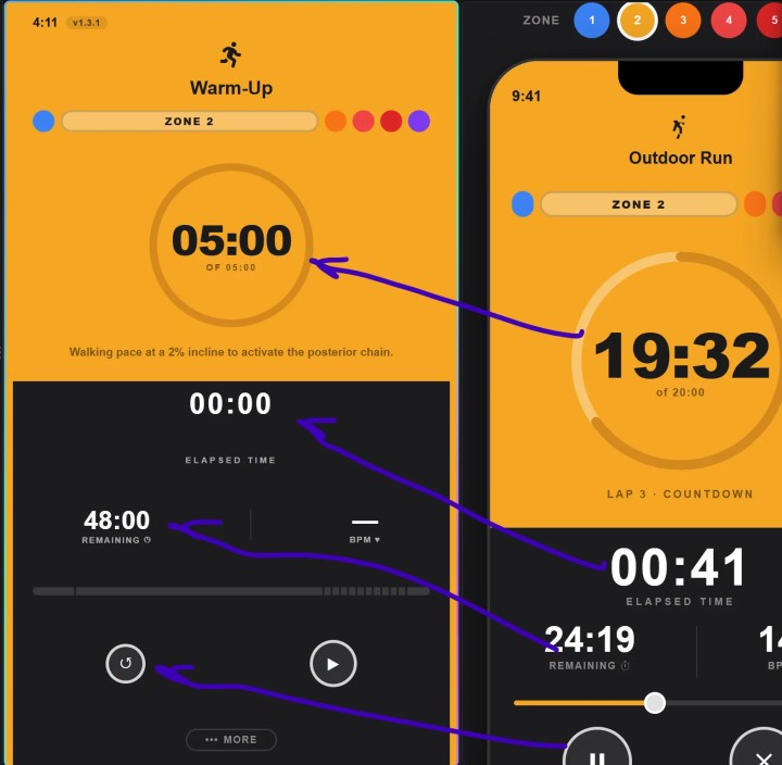
More than half of my follow-up prompts were a screenshot with a circle or an arrow on it and a sentence or less. I’ll come back to why that works so well.
6. Context engineering: the skill that actually mattered
“Prompt engineering” is the wrong frame. Individual prompts were short and casual. What made the work go well was the context around them: what the model could see, compare against, and not get wrong.
1. Show, don’t describe. A screenshot with an arrow on it carries position, size, colour and intent in one shot. “Make the circle bigger” is ambiguous. A circle drawn around the part that’s too small isn’t.
2. Put the spec in the repo. I kept a wireframe.html: the target design, as a real page. Then I could say “if you compare wireframe.html with index.html, the start/restart button size is small, also the count down circle and font is smaller. Can we match exact size?” The model had a ground truth to diff against instead of my adjectives.
3. Write down the rules, not the vibes. The colour-precedence rule. The “current small, upcoming big” rule. Rules are checkable. Vibes aren’t.
4. Close the feedback loop. I put the version number in the corner of the UI (v1.4.0). When you’re iterating on a phone with a service worker caching your files, you will waste time staring at a stale build and blaming the code. A visible version badge answers “is this the new one?” at a glance. At one point I literally had to ask: “can you update the version of the app, so it will refresh worker.”
5. One concern per message. “Slightly bigger circle.” “If there is no incline data for next phase, we can show the same from current phase.” Small asks get small diffs, and small diffs are reviewable.
6. Choose a stack the model can hold in its head. About 3,100 lines of plain JS, CSS and HTML. The whole app fits in a context window, which means every change was made with the full picture. A framework, a bundler and a state library would have meant the model working from fragments.
And the failure mode, which is real: context rots. My README still describes the app as it was on day 0. It doesn’t mention zones, the PWA or the login gate. Stale context is worse than none, because the next session will trust it.
7. AI slop: what it looks like, and how I caught it
“AI slop” isn’t just bad output. In a codebase it’s plausible-looking stuff nobody asked for that quietly accumulates. Here are real receipts from this repo.
Reference text leaked into the product. The “Great UI v1” commit shipped a subtitle reading “Taylor’s Apple Watch Ultra” and a hard-coded 9:41 clock, both copied faithfully from the reference screenshot. Not wrong, exactly: too literal. The model matched what it saw. It took me to notice that a stranger’s watch name had become part of my app.
CSS bloat, then a purge. The stylesheet went from 680 lines to 1,669 in a single commit, then back down to 1,247 in the next. That purge commit, taken as a whole, deleted 991 lines and added 666. Ask for deletions on purpose. Left alone, code only grows.
Defensive code nobody needs. The zone-theming function has this shape, twelve times over:
const statusTime = (typeof els !== 'undefined' && els.statusTime)
                || document.querySelector('.status-time');
els is declared above, always. Each patch added a belt and braces. It works. It’s also noise that makes the real logic harder to see.
Config nobody uses.
- Two manifests (
manifest.jsonandmanifest.webmanifest); only one is linked. - An
.htaccessfile, though Vercel doesn’t read Apache config. - A leftover
icon-orig.png.
Docs that lie politely. The README says “no dependencies”; the page loads Font Awesome from a CDN. The Max HR dialog promises “your 5 training zones”; the app has six.
One version in eleven places. 1.4.0 appears 11 times across three files (cache name, query strings, in-app label). Bumping it by hand is exactly the kind of chore that gets skipped or half-done.
A lock that isn’t a lock. The app has an RSA login gate: you paste a private key, it’s verified in the browser. It’s fine for keeping a personal tool off the casual radar. It is not security: the public key and all the code are visible, and anyone can set the session flag in devtools. That’s acceptable because there’s nothing secret in the app, but don’t confuse the two. (I used exactly that flag to take the screenshots for this post.)
How to avoid it
- Read the diff stat, not just the screen. If you asked for a colour change and got +900 lines, stop.
- Ask for deletion. “Simplify this”, “remove anything unused” is a legitimate prompt, and often the best one.
- Test on the real device. My commit log is full of mobile-only fixes: “more button was hidden”, “remove top gap”, “fix clock duplicate”. Desktop previews don’t show you browser toolbars and safe areas. The phone does.
- Give it a source of truth for anything that repeats. Versions, colours, zone thresholds. One place.
- Make docs part of “done”. “Update the README” belongs in the same prompt as the feature.
- Be suspicious of anything copied from a reference. Names, placeholder text, hard-coded values.
- Keep a CLAUDE.md. The rules you keep repeating belong in a file the model reads every session. (The one thing on my own to-do list.)
- Not every bug is a code bug. When the “Install app” option didn’t appear on my Pixel, Claude checked the live manifest, service worker, icons and HTTPS. All were valid. The cause was on the device side, and no amount of code changes would have fixed it.
The principle behind all eight: the AI is a fast, tireless, literal junior engineer. You’re still the reviewer.
8. What it did for me
RunMe will never be on an app store. There’s no roadmap, no analytics, no subscription, and no plan to share it. It exists because a specific person wanted a specific screen on a specific treadmill.
And it changed my routine. Training stopped being “figure out what’s next” and became “press start”. The plan is in the app. The zones are on the screen. The watch is feeding it live. There’s nothing left to decide mid-run except how hard to push.
It also quietly changed how I think about software. A tool that exactly fits one person’s life used to be too expensive to build. It isn’t any more.
9. If you’re just starting out
I’m writing this for people who are new to building with AI. Here’s what I’d actually tell you:
- Start with an itch, not a product. Something you need tomorrow morning. You are the best possible tester, because you’ll feel every flaw.
- Pick a boring stack. Plain HTML, CSS and JS plus a free host. Fewer moving parts means fewer places for slop to hide.
- Ship ugly first. My first version was a dark page with grey boxes. It was running at dawn. Polish came because it was already in use.
- Use your eyes as the spec. Screenshots, wireframes, arrows. Show it.
- Stay the reviewer. Read the diffs. Ask “why is this here?” Delete things.
- Learn the platform, not just the prompt. The whole Garmin integration is about fifteen lines because the browser already has the pieces: GATT services, notifications, secure contexts. Knowing those names is what lets you ask for the right thing, and spot a wrong answer. The AI makes you faster at what you understand. It doesn’t replace understanding it.
The distance between “I wish there was an app that…” and “there is.” has never been shorter. Close it for something small and personal, then notice how it feels to use software that was made for exactly you.
Appendix: the app at a glance
index.html      Markup + block templates for the editor
css/style.css   Styling, zone theming, responsive layout
js/app.js       Plan model, timer engine, Bluetooth HR, wake lock, UI wiring
js/auth.js      Client-side key gate
sw.js           Service worker (offline shell)
manifest.json   PWA manifest
Features: structured plans (steady + interval blocks) · big countdown with ring · current → upcoming pace and incline · live HR over BLE with zone theming · 10-second warning chime and transition cues · screen stays awake · installable PWA that works offline · JSON import/export.
Screenshots in this post were re-rendered from each git commit, with the exception of the three hand-annotated images, which are real screenshots from my iteration sessions. The v1.4.0 views use a numeric demo plan similar to the one I actually run.


